The ALENTAR-J-CM project launches a new visual identity reflecting its commitment to innovation, research, and the emotional well-being of young people.
The renewal includes an updated logo, a color palette that conveys trust and hope, and a more accessible web design aimed at scientific dissemination.
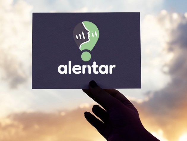
The split “n” creates a visual link between Alentar and Alertar.
The ALENTAR-J-CM logo combines the concepts of alentar (to encourage) and alertar (to warn), expressing both support and prevention. The upward-facing profile symbolizes hope and a positive attitude, while the waves represent thought and communication. The divided “n” creates a visual connection between the two ideas—alentar and alertar—reflecting the process of accompanying those who are facing a vulnerable situation.
The exclamation mark acts as a central element, reinforcing the idea of attention and alertness in youth mental health.
The alert symbol as a narrative thread.
Based on the project’s own name, ALENTAR-J-CM, which conveys support and encouragement, another fundamental idea emerges: the importance of ALERTING. For this reason, we chose the exclamation mark—commonly associated with alertness—as the central symbol in the construction of the logo.
With this new identity, the project strengthens its mission to connect research in artificial intelligence and mental health with society, institutions, and professionals committed to prevention and the improvement of psychological well-being among youth.
Share your thoughts on our new visual identity in the comments — we’re excited to hear what you think!


